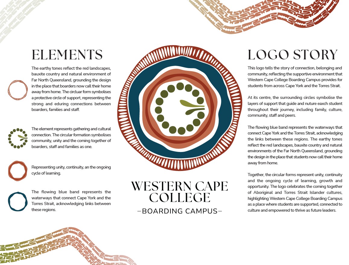
You may have already noticed our new Western Cape College Boarding Campus logo appearing across our social media channels, publications and throughout the school and wider community.
Our new logo was developed by Lola Digital in consultation with our boarding students, staff, families and community. We are especially proud that the creative team included Laura de Jersey, a former Western Cape College boarder from Mapoon, whose lived experience helped ensure the logo authentically reflects the stories, cultures and experiences of the young people who call our boarding campus home.
The logo tells the story of connection, belonging and community, reflecting the supportive environment we strive to provide for students from across Cape York and the Torres Strait. At its centre, the surrounding circles symbolise the layers of support that guide and nurture each student throughout their journey, including family, culture, community, staff and peers. The flowing blue band represents the waterways that connect Cape York and the Torres Strait, while the earthy tones reflect the landscapes of Far North Queensland and the place our students now call their home away from home. Together, these elements represent unity, continuity and the ongoing journey of learning, growth and opportunity.
More than just a logo, it represents our purpose. It reflects our commitment to providing an exceptional boarding experience where students feel connected, remain proud of their culture, achieve their educational and personal goals, develop independence, and leave our campus ready to thrive beyond school.